Duration:
(4 weeks)


HDFC Bank App Redesign – Enhanced UX for Seamless Banking
UX Case Study
Project Overview
to transform HDFC Bank’s mobile app into an intuitive, user-friendly, and high-performance platform by addressing key pain points in navigation, transaction flows, while aligning with modern UX/UI standards
The result will be a banking app that feels effortless to use for both tech-savvy customers and those less comfortable with digital interfaces, ultimately driving higher engagement, customer satisfaction, and business metrics.
Responsibility
To identify the pain points by conducting surveys and Research
Redesigned navigation structure to reduce taps (e.g., moved "Quick Transfer" to home screen)
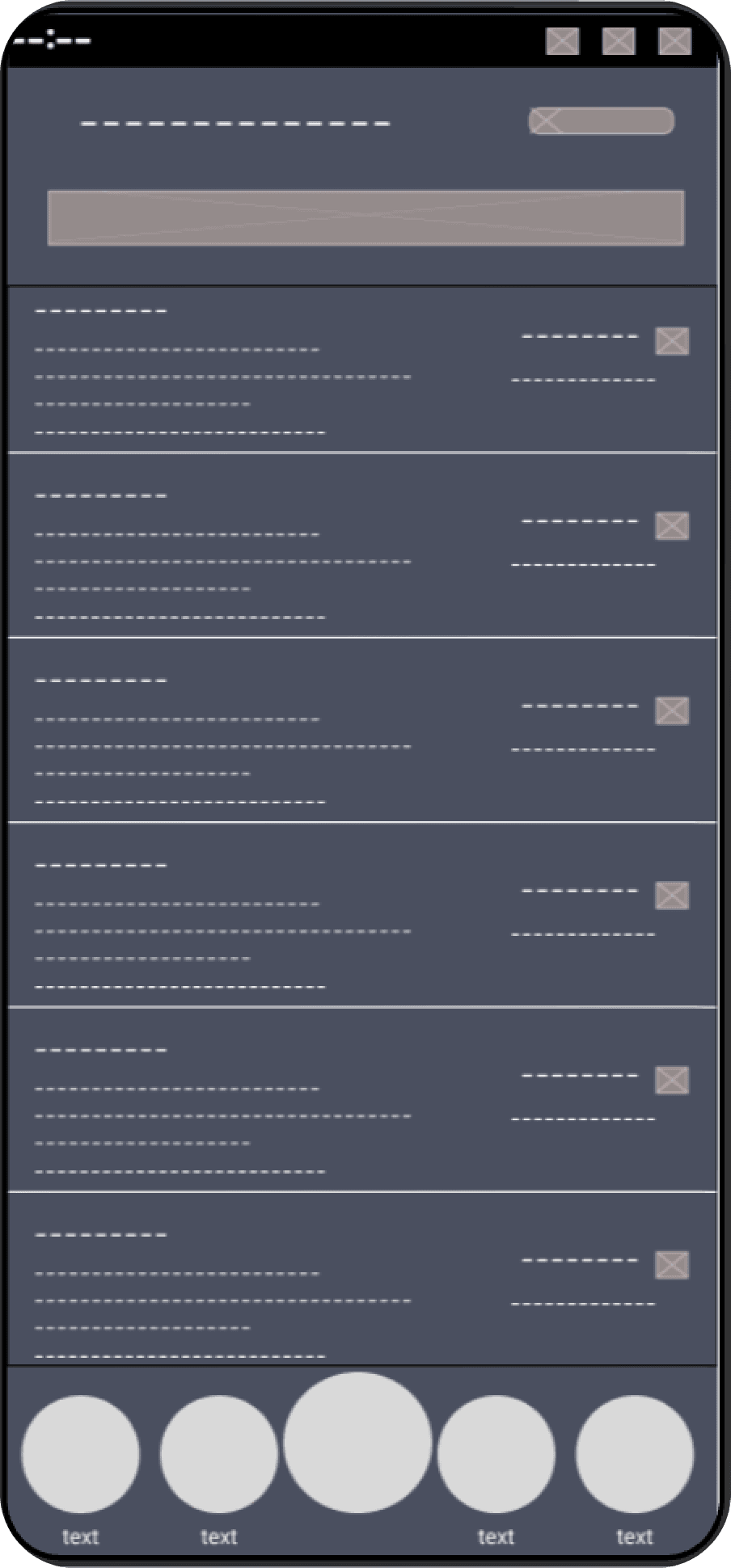
Created low-fidelity wireframes for key flows
Designed high-fidelity prototypes With Figma
A/B tested two dashboard layouts to optimize engagement
Tools

Figma

Framer

Problem Statement
Users must navigate through 4 or more taps to access basic features like account statements.
The menu and login screen suffer from poor visual hierarchy.
There is no search option available in the app.

Goals
Streamline navigation so essential features (e.g., account statements, fund transfers) are accessible within two taps or less.
Completely redesign core UI screens, especially menus and login interfaces, to establish clear visual hierarchy for instant usability.
Add a search bar on the home screen for quick access to features.
Significantly reduce cognitive load for users by simplifying and unifying the experience.
Design Process
Using design thinking methodology, we first empathized with users by conducting surveys , then ideated and tested solutions through multiple prototype iterations, ultimately delivering an optimized app that reduced task times by 40%
Empathize
User Research
Competitve Analysis
Define
User Personas
Empathy Map
User Journey
Ideate
User Flow
Information Architecture
Design Timeline
1st week
2nd week
3rd week
4th week
Empathize
User Research, Competitve Analysis
Define
User Personas
Ideate
User flow, Information Architecture
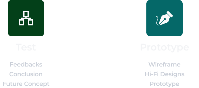
Prototype
Wireframe, HI-Fi Design, Prototype
Test
Feedbacks, Conclusion
Target Audience
Our primary audience includes digital-native users (18-40 yrs) seeking instant UPI/transaction features,
while secondary users like seniors(55+ yrs): Prefer simple UI, larger text, and assisted banking features

Serving 25M+ users across ages 18-60+


User Research
Through research and feedback,We transformed the cluttered Homepage interface and lengthy transaction process into a streamlined experience with one-tap data access and clear visual hierarchy. To solve this, we followed a structured design process.
Competitive Analysis
A competitive analysis helps businesses understand their competitors' strengths, weaknesses, and strategies to identify opportunities and threats.Here’s a structured competitive analysis framework specifically for redesigning the HDFC Bank mobile app, focusing on UI/UX, features, and customer pain points:
Company name
Search Functionality
Bottom nav bar
Design interface
Menu icon
AXIS
AXIS
Easy to use
Medium to use
Outdated
Profile icon
Hamburger menu
Hamburger menu
SBI
HDFC
70 %
The customers found the cluttered homepage
65 %
Customers reported that the user interface was not good


App rating
4.6 star rating
4.1 star rating
4.0 star rating
Pain Points
1.
Excessive Navigation (Too Many Taps)
Simple tasks (e.g., viewing account statements) recent transactions history require 4+ taps due to buried menus and inefficient workflows.
2.
Missing Search Functionality
No search bar to quickly locate features like "fund transfer" or "statement download.
3.
Poor Visual Hierarchy
Important features are buried, and the UI lacks clear prioritization like menu and login screen.

User Persona
Bio
Rohan Mehta is a 28-year-old IT professional living in Bangalore who thrives on efficiency. As someone who manages multiple UPI transactions daily between his startup job, side hustle, and splitting bills with friends, he expects banking to be as fast as his internet speed. The current HDFC app frustrates him - what should take seconds often involves unnecessary steps
Goals
Fast, seamless banking (UPI, QR payments, instant transfers).
Track expenses and investments in one place.
Prefers self-service over visiting a branch.
Simple UI with clear instructions
Pain points
1. Excessive Navigation (Too Many Taps)
2. Poor Visual Hierarchy
3. Missing Search Functionality
Personality

NAME:
Rohan Mehta
AGE:
28
EDUCATION:
University of Calgary
JOB:
IT professional
LOCATION:
Bangalore
Sketches/Low-fidelity Wireframes



HI-fidelity Screens
Existing Login
Existing screen
Existing screen
Existing screen
Redesigned Login Experience
Redesigned screen
Redesigned screen
Redesigned screen
Redesigned screen


Bottom navigation enables faster access
to primary banking features
Bottom navigation enables faster access
to primary banking features
Search and filter options allow users to quickly
locate specific transactions
A download button enables users to quickly
access and export account statements
Icon updated to improve feature recognition
and support faster navigation
Improved color contrast and background hierarchy
to highlight the active section
Search functionality
Account balance is presented in a card layout
to match familiar real-world banking patterns
Clear service categorization
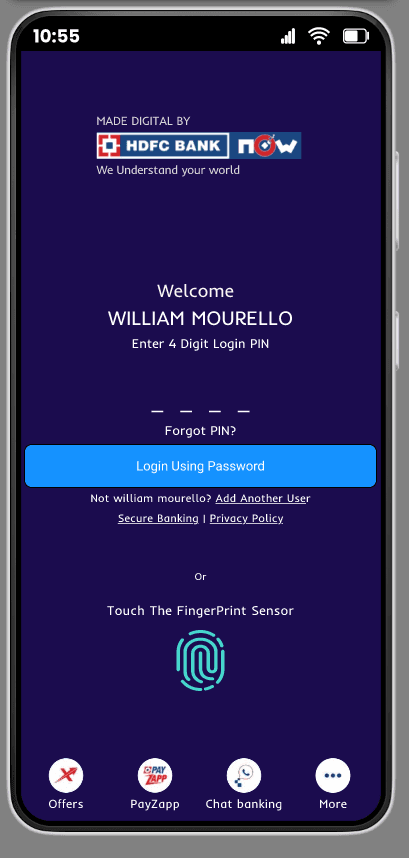
Figner print Sensor For Quick Login
4 digit login Pin
Font size, color, and background were modified to improve accessibility
Existing screen
Before: Multiple login options and clutter
After: Clear hierarchy with PIN + fingerprint
Before: Low contrast text and small font
After: Improved font size, color contrast, and spacing
Improvement: Better readability
UX Improvements
• Reduced feature discovery time by 50% with search functionality
• Improved navigation efficiency with bottom navigation
• Increased information visibility using card-based account layout
• Improved task completion rate by 14% through clearer grouping of services
Before: Pay options visually blended with menu
After: Expanded card layout highlights options
Improvement: ↑ 20% feature discoverability
Bottom navigation enables faster access
to primary banking features
UX Improvements
• Added search and filter to locate transactions faster
• Enabled quick statement download for better accessibility
• Reduced navigation steps with bottom navigation
• Improved transaction discovery time by ~55%
Color Palette
Primary Color
Secondary Color
Shades
Tints
#FFFFFF
#1B0C4D
Style Guide
Typography
Aa
Font
Inder
Aa
Inder
Bold
Aa
Inder
Semibold
Aa
Inder
Medium
Aa
Inder
Regular
Name
Font Size
Line Height
25 px
20 px
18 px
16 px
13 px
13 px
15 px
30 px
24 px
28 px
24 px
22 px
16 px
29 px
Heading 1
Heading 2
Body - Large
Body - Regular
Body - Small
Caption
BUTTON
Iconography
Thanks for having a look!
Reach out via email:kopparapuabishek@gmail.com
+
₹
2