
Scalable
& Reusable
Design Systems.
Built using Atomic Design to support multiple products with consistency and efficiency.

Atomic Design Method
Atomic design is a process that consists of five separate steps that work together to build more coherent, hierarchical, and thoughtful interface design systems. Created by Brad Frost, through this method chemistry analogy helps us in creating a comprehensive system in design. The following are the five stages of atomic design.
Atoms
These are the smallest units that cannot be broken down into parts without losing their meaning.
Molecules
Molecules are group of atoms that work together to form more complex UI elements.
Organisms
Organisms are more complex UI elements made up of molecules or atoms or smaller organisms. These are relatively complex sections of user interfaces.
Templates
Templates in design systems are more complex UI elements which are made up of multiple organisms and molecules. Templates are equivalent to wireframes containing grayscale placeholders before real content is available.
Pages
Pages are specific instances of templates that show what a UI looks like with real representative content in place. The page stage is the most concrete stage of atomic design, and it’s important for some rather obvious reasons.

Problem
The product had:
Inconsistent buttons
Multiple spacing patterns
Typography mismatches
Duplicated components
Inefficient developer handoff
This caused:
Slower design iterations
Inconsistent UX
Scalability issues
Create visual consistency
Improve scalability
Speed up design workflow
Standardize components
Simplify developer handoff
Improve accessibility
Goals

Buttons
Buttons are clickable elements that are used to trigger actions. They communicate calls to action to the user and allow users to interact with pages in a variety of ways. Button labels express what action will occur when the user interacts with it.
Variants
Each button variant has a particular function and its design signals that function to the user. It is, therefore, very important that the different variants are implemented consistently across products to convey the correct actions.
Default
Hover
Selected
Focused
Disable
Danger
Primary
+
Button
+
+
Button
+
+
Button
+
+
Button
+
+
Button
+
+
Button
+
Secondary
+
Button
+
+
Button
+
+
Button
+
+
Button
+
+
Button
+
+
Button
+
Iconic Buttons
+
+
+
+
+
+
An Action button signifies a significant system commitment action such as printing, copying, sending, etc
Primary
Primary flow
Secondary
Teritary
Danger
For the principal call to action on the page. Primary buttons should only appear once per
screen (not including the application header, modal dialog, or side panel).
For secondary actions on each page. Secondary buttons can only be used in conjunction
with a primary buttom As part of a pair, the secondary button's function is to perform the
negative action of the set, such as "Cancel" or "Back". Do not use a secondary button in
isolation and do not use a secondary button for a positive action.
For less prominent, and sometimes independent, actions. Tertiary buttons can be used in
isolation or paired with a primary button when there are multiple calls to action. Tertiary
buttons can also be used for sub-tasks on a page where a primary button for the main and
final action is present.
For actions that could have destructive effects on the user's data (for example, delete or
remove). Danger button has three styles: primary, tertiary, and ghost.
Different States of Button
Button Properties


Checkbox
Checkboxes are used for multiple choices, not for mutually exclusive choices. Each checkbox works independently from other checkboxes in the list, therefore checking an additional box does not affect any other selections.
When to use
Checkboxes are used when there are multiple items to select in a list. Users can select zero, one, or any number of items.
When not to use
If a user can select only one option from a list, radio buttons should be used instead of checkboxes. Checkboxes allow the user to select multiple items in a set whereas radio buttons allow the user to select only one option.
Default
Selected
Hover
Error

Different States of Checkbox
Structured List
Structured list displays a simple list with a considerable amount of items in multiple rows. It helps organize and present grouped information into logical and scannable patterns. The content within a structured list can be stacked to create hierarchy within the data. Structured lists can have read-only or selectable rows.
Different Types of structure list


Tab System
Tabs are used to organize related content. They allow the user to navigate between groups of information that appear within the same context.
Selected
Hover
Do
Keep tab labels short and clear
Use consistent naming across tabs
Maintain visual distinction for active state
Don’t
Overflow tabs on small screens (use dropdown instead)
Mix unrelated content
Disable tabs without explanation
Label 1
Label 2
Label 3
Label 4
Label 1
Label 2
Label 3
Label 4
Text Field
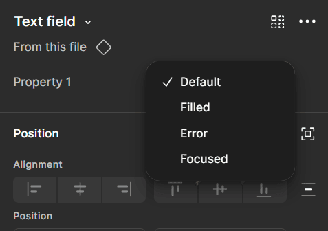
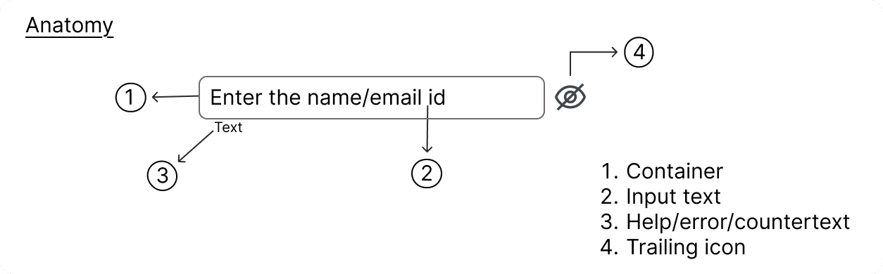
Text inputs enable users to enter free-form text data. The type of text field used should reflect the length of the content you expect the user to enter. The default text input is for short, one-line content, whereas text area is for longer, multi-line entries.
Default
Filled
Focused
Hint text
Enter the name/email id
Hint text
Enter the name/email id
Hint text
Enter the name/email id
Hint text
Enter the name/email id
Different Types of structure list
Progress Bar
Determinate
Indeterminate
DeterminateUse : determinate progress bars where there is clear information about the progression they convey exact and qualitative information about the progression.
IndeterminateUse : indeterminate progress bars where there is unclear information about the progression they convey that users’ request, action, or data is being processed at the moment without indicating how long the activity will take.
A progress bar can either be determinate or indeterminate. The determinate variant is visualized as a track on which a bar fills up from left to right representing the progress. The indeterminate variant is visualized as a track on which a bar is moving along in constant speed, repeating over time.
Dropdown
Dropdowns can be used in forms on full pages, in modals, or on side panels. The dropdown component is used to filter or sort contents on a page. It is a stylized version of the select component, and can be styled as needed.
There is no minimum or maximum width for a dropdown. The width can be customized appropriately for its context.
Never use decorative images or icons within a dropdown.
Avoid multiple lines of text in a dropdown. If the text is too long for a single line, add an ellipsis (…) for overflow, and use a tooltip to display the full text
Select from dropdown
Select from dropdown
List1
List2
List3
List4
List5
Toggle
Toggle is a control that is used to quickly switch between two possible states. Toggles are only used for these binary actions that occur immediately after the user “flips the switch”. They are commonly used for “on/off” switches.
To turn off and on a single option that affects the system or page settings.
Ideal for settings or preferences that can be immediately applied.
Recommended for actions where the change is reversible without additional confirmation.
DIfferent States of Toggle button


Search
Search enables users to specify a word or a phrase to find relevant content without navigation.
Search
Search
When to use
To help users find data more efficiently within a complex or large data set.
Use at a global level when searching an entire site.
Use at a page level when searching through content on one page specifically.
Use at a component level when searching data in a component, like a data table.
When not to use
Do not use when there is small or limited amounts of data.
Do not use when the information is simple and can be found easily within one view.
Cards
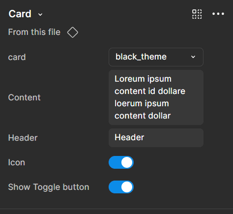
Card Properties
A card can be used to display content related to a single subject. The content can consist of multiple elements of varying types and sizes.

Modal
When requiring users to interact with the application, but without jumping to a new page and interrupting the user's workflow, you can use Modal to create a new floating layer over the current page to get user feedback or display information.
Reboot
Do you want to Reboot the device
Cancel
OK
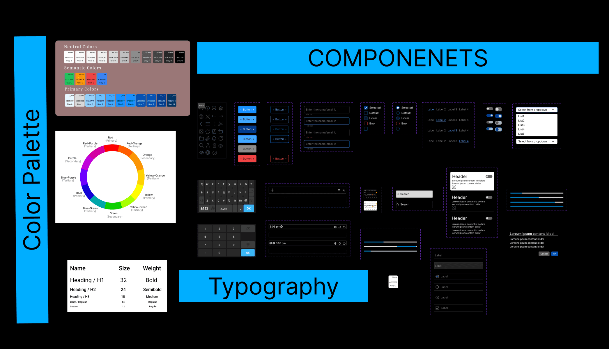
Color & Typography
Typography is designed to balance clarity, hierarchy, and brand personality across all interfaces.
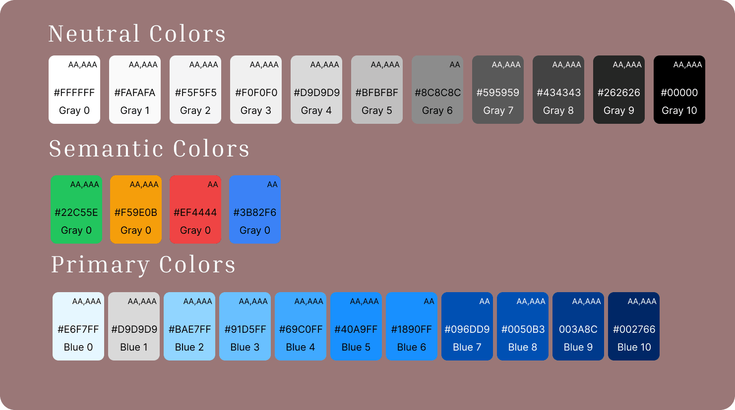
Key Components of a Design System Color Palette
Neutral Colors: Grays used for text, backgrounds, borders, and disabled states.
Semantic/Functional Colors: Colors indicating status, such as green for success, red for error, yellow for warning, and blue for information
Primary Color: The main brand color used for primary actions, top bars, and key components.
Secondary/Accent Color: Used to highlight specific elements, such as buttons, links, or alerts..
Core Color Theory Rule for Design Systems
60-30-10 Rule: For balanced UIs, 60% is typically a neutral base color, 30% is a secondary/secondary brand color, and 10% is an accent color.
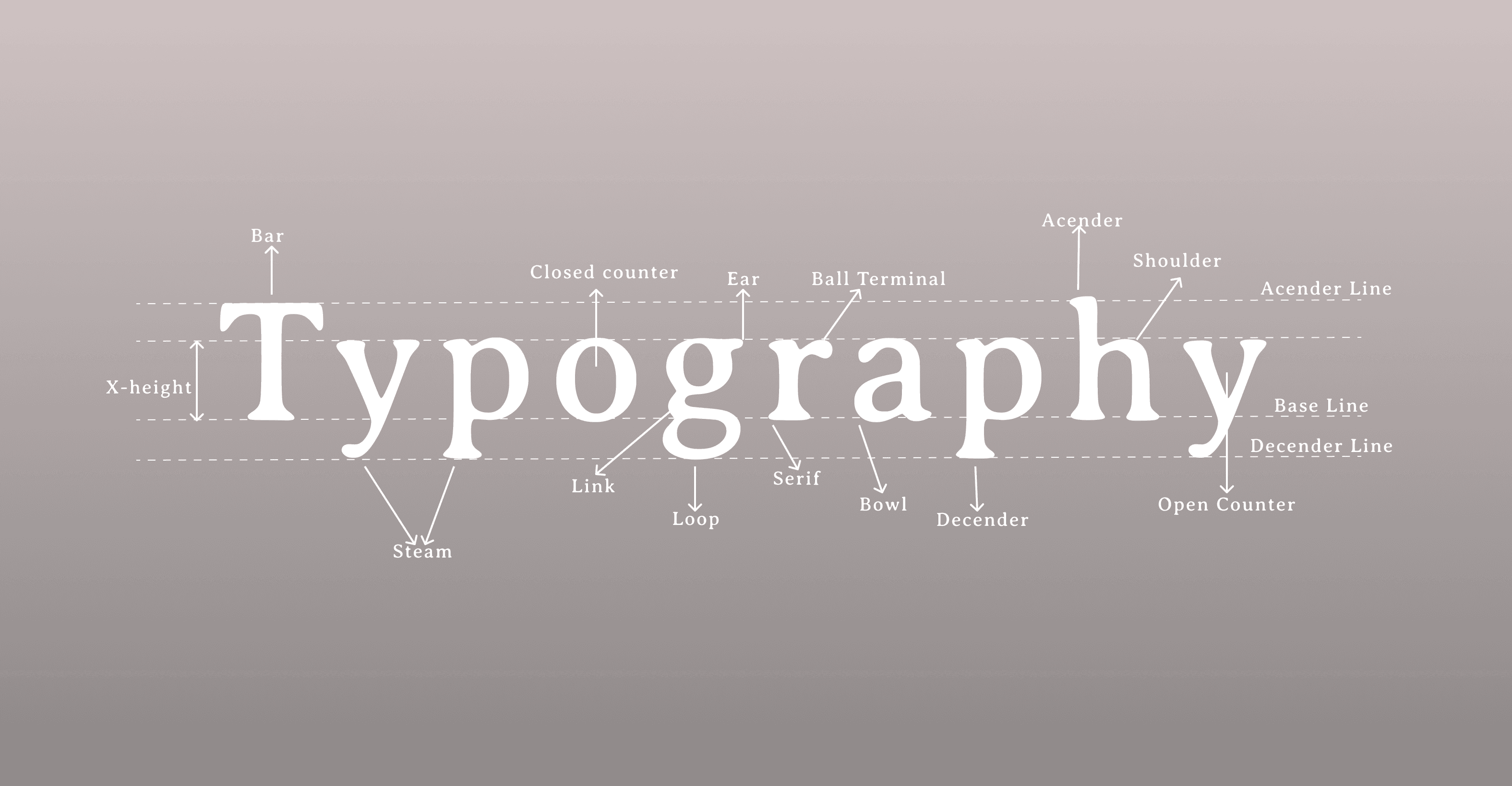

Name Size Weight
Heading / H1 32 Bold
Heading / H2 24 Semibold
Heading / H3 18 Medium
Body / Regular 14 Regular
Caption 12 Regular


WCAG contrast
Typography readability
Touch target sizes
Consistent interaction states
Accessibility Considerations
Developer Collaboration
Reduced design inconsistencies
Improved UI scalability
Faster developer handoff
Improved design efficiency
Easier maintenance
Reusable components across products
Impact
Thanks for reviewing the Project
reusable naming structure
Auto Layout usage
component variants
responsive behavior
easier implementation

